Mark Noë, Founder and CEO of Noë & Associates shares his concept ideas and design approach behind 7N Architect’s website and visual identity.
Although Noë & Associates are based in New York City, as an internationally regarded branding and design agency, we are regularly commissioned by clients in every corner of the world.
Noe & Associates’ methodical approach to getting under the skin of a client’s essence and helping to bring that to life through graphic interpretation was the principal reason for David Reid of Because Brands Matter recommending the collaboration to his client 7N Architects. David has worked with us previously and we were interested to work with 7N Architects to create a graphic design that brought to life their values and aspirations, speaking directly about the transformative impact of 7N Architects’ projects. Working with this as our creative steer we advised on the art direction of all project documentation and recommended using Glasgow based photographer Gordon Burniston to capture the essence of 7N’s projects and compliment our creative design.
The identity system needed to meet the ambitions of a modern, opinionated architecture practice and have restrained sophistication that could meet a range of expressions - Characterful yet enduring. Busy, yet ordered. Leading, but always engaging.
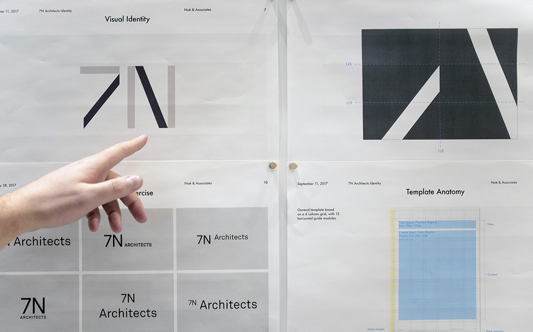
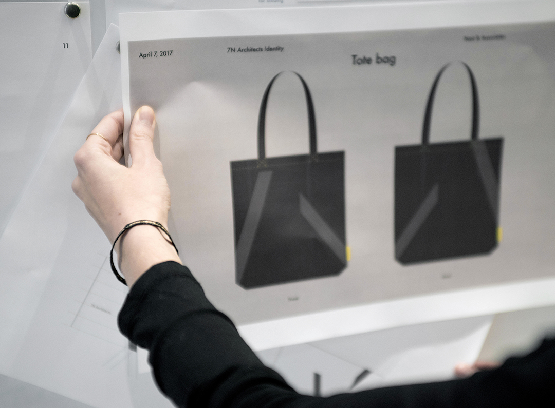
The basis we chose for the wordmarque was a modern sans serif typeface which contains a distinct architectural quality. The 7 and N are used as an expressive shorthand for the identity’s ‘kit of parts’. This 7N monogram is the most expressive part of the identity. It is used as scale, is flexible and responsive.
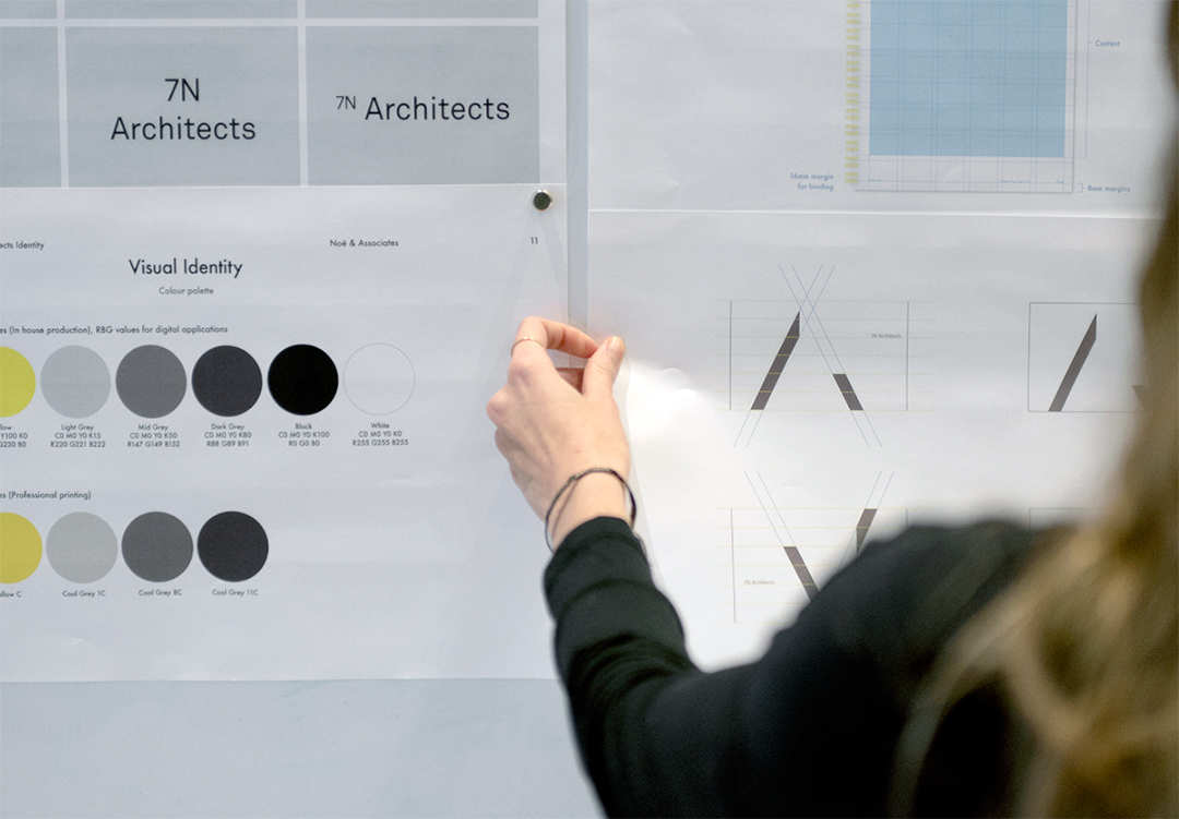
The graphic elements were complimented by a restrained palette of tactile, self-coloured stocks, and a bright yellow highlight. This combination of natural materials and a pop of primary colour directly references 7N Architect’s bold use of colour within several of their projects.
The distinct display typeface, called “Practice” designed by type designer Philip Cronerud, used in the wordmarque is contrasted with a secondary typeface creating a rich and robust editorial combination. This editorial approach to the typography was an important part of fulfilling the brief for the website, enabling it to become an evolving platform and voice for the team.
The new look provides a much richer experience looking inside the practice, meeting the people that make up its talented team and the award winning work that they create.
The entire design process has been deliberately measured over a period of some ten months. Time and care has been taken throughout and we believe is an excellent example of two creative companies working in close partnership to create a body of work that we feel will test the time for several years to come.
We are extremely excited about it going live.
Mark Noë Founder and CEO Noë & Associates


